Mila Beauty Collagen Logo
The heart symbol, which is claimed to have been inspired by the shape of a swan couple’s union in the middle of the lake; has been the representative of loyalty, love and devotion.
In this logo design, we used the brand promises for their target audience such as “beauty, youth and skin elasticity” in the brand’s logo by transforming it into the “M” form, which is the initial letter of the word “Mila”.
Borka Metal Logo
Borka has adopted corporate branding as a vision and can be a fresh blood for the sector. The perception of the brand identity they want to create in their employees, business partners and customers are; a consistent, reliable, successful and high quality brand.
In the brand logo design, it is aimed to increase the readability of the brand name in the logo by writing the text “Borka” in a simple way. A cut-out drawing was made in the middle to emphasize the slitting process, which is a sectoral term.
Mogu Mogu Logo
Since Mogu Mogu is a brand that produces products related to baby textiles, we used orange color in our logo design to give the feeling of warmth and sincerity.
The logo was designed as a wordmark logo (logotype). The reduplicated brand is intertwined and illustrated with a cheerful and animated font. The letters “o” and “g” in the brand name are given a smiley face to reinforce the perception of brand satisfaction.
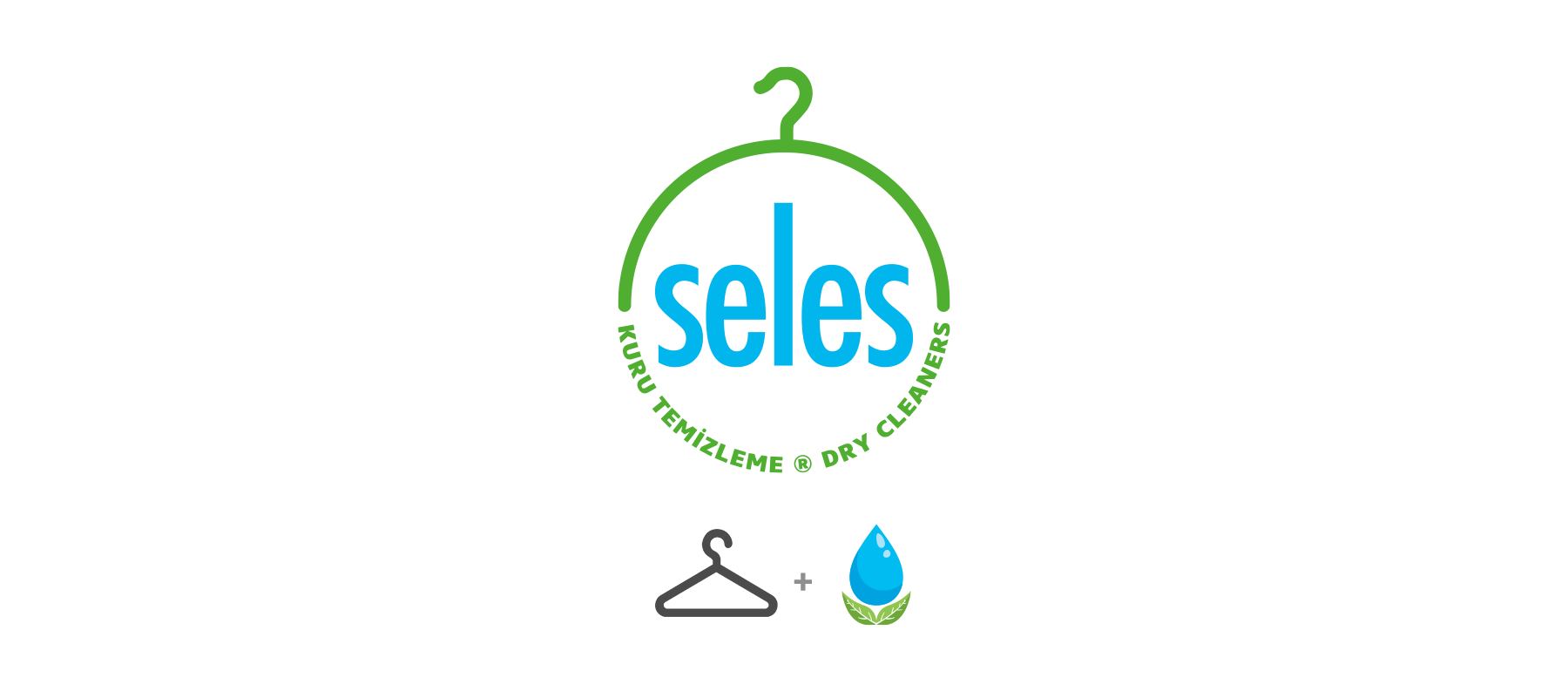
Seles Dry Cleaning Logo
Seles brand logo was designed as a combination logo with the intent to point to the brand’s sector by using the hanger icon. The font of the “Seles” was designed in a modern way without using serif fonts, taking into account the region where it is located and the customer portfolio it appeals to.
Runner Food and Beverage Management Logo
Runner is a brand which provides services and training on restaurant management. The logo is designed as a combination logo. A modern, serif-free and curved font is used in the brand logo to show the perception of speed and the ever-evolving sector.
Denge Consultancy Logo
The Denge Consultancy logo is designed as a combination logo. The emblem of the logo is designed with sectoral markers placed inside the letter D. It is intended to depict the brand’s consultancy status with a dip pen, and the brand name “Denge” was referred with the use of scales.
Babyes Logo
Babyes is a brand which produces baby equipment. The logo is designed as a wordmark (logotype). A smiling face was tried to be depicted by using the forms of the letters to show the perception of brand satisfaction. The letter “a” was separated from the brand name script to emphasize quality. (A Quality term as in best-quality).
Casa Royal Kitchen Supplies Logo design
The Logo is designed with the intertwined initial letters of the brand name, “C” and “R”. The second ring surrounding these letters is associated with the commercial activity of the brand, such as pots, etc. Finally, in order to emphasize the meaning of the words “Casa Royal”, a crown figure is likened to chef’s hat to point out to the sector that the brand operates. The emblem refers to “The Brand Used by the Best Home Chefs”.